Field note 03/ Web Design
Small Business Website Examples: 10 Design Lessons
Explore real small-business website examples and ten design lessons, with screenshots showing clear services, useful navigation, and ways to get in touch.
A useful business website helps visitors understand what you offer and take the next step. These examples show how that works on real sites: finding a service, checking a location, requesting an appointment, or choosing a product.
The ten lessons below draw on six websites ComCreate has worked on. Each one points to a visible design choice and something you can check on your own site. Screenshots were captured on September 22, 2026; they show the pages at that time, not measured conversion results.
1. Say what you do and where you work
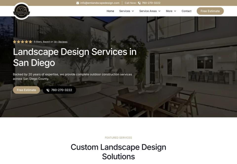
EM Landscape & Design names landscape design and San Diego in its opening headline. A visitor can judge whether the business offers the service they want in the right area before reading further.
Use that test on your own homepage: could someone unfamiliar with your business identify the service and location without opening the menu?
2. Make the first contact step clear
The same EM Landscape section offers a free-estimate link and a phone option. These give a visitor two clear ways to start a conversation. They do not need to decide which page might contain contact information.
Choose the action your team can reliably handle. A quote request should reach someone who can follow up, and a phone link should use the correct number. Check both on a phone as well as a desktop.
3. Make business credentials easy to find
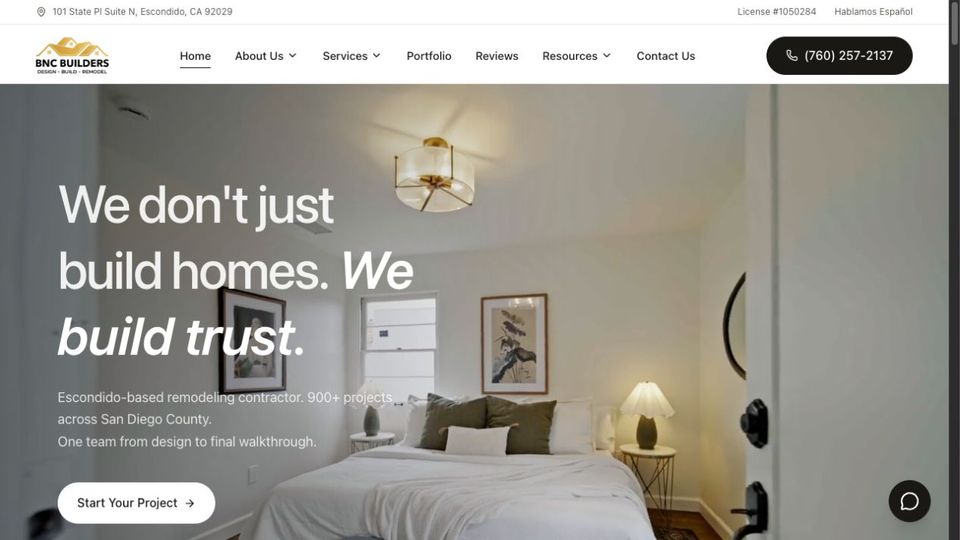
BNC Builders displays its contractor license number in the header. This makes the detail easy to locate alongside the business identity and navigation. Its presence on the page is an observation; this walkthrough does not independently verify license status.
If credentials matter to your customer, provide accurate details and a way to check them. Avoid decorative badges that imply verification you cannot substantiate.
4. Organize services so visitors can choose
BNC groups its menu into interior and exterior work and links to individual services elsewhere on the homepage, including kitchen remodeling, bathroom remodeling, and ADUs. A homeowner can move from a broad category to the work they need.
Use recognizable service names. A visitor looking for a bathroom remodel should not have to interpret an internal department name to find it.
5. Explain the available service choices
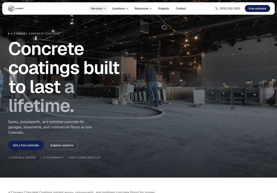
Four Corners Concrete Coatings names epoxy, polyaspartic, and polished concrete near the start of its homepage, with a link to explore its systems. The site also provides separate service pages for those choices.
When customers may not know the technical differences, use the overview to orient them and the detail pages to explain suitability, preparation, and care. A list of unfamiliar product names alone is not enough.
Visit Four Corners Concrete Coatings
6. Explain what happens after an inquiry
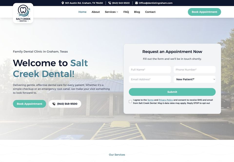
Salt Creek Dental places an appointment-request form near the opening of its homepage. The form says the practice will be in touch, which describes a request followed by staff contact rather than an immediately confirmed booking.
Match the language to what your form actually does. If someone must call back, say so near the form. If visitors can reserve a confirmed time, show that confirmation clearly.
7. Keep a phone option available
Salt Creek also shows a phone option alongside its appointment link. Visitors can choose a conversation when a form does not answer their needs.
Make the number readable and usable as a phone link. Check that it matches the intended destination. Do not assume that showing a number proves someone will answer; staffing and follow-up are separate parts of the experience.
8. Separate location choice from program choice
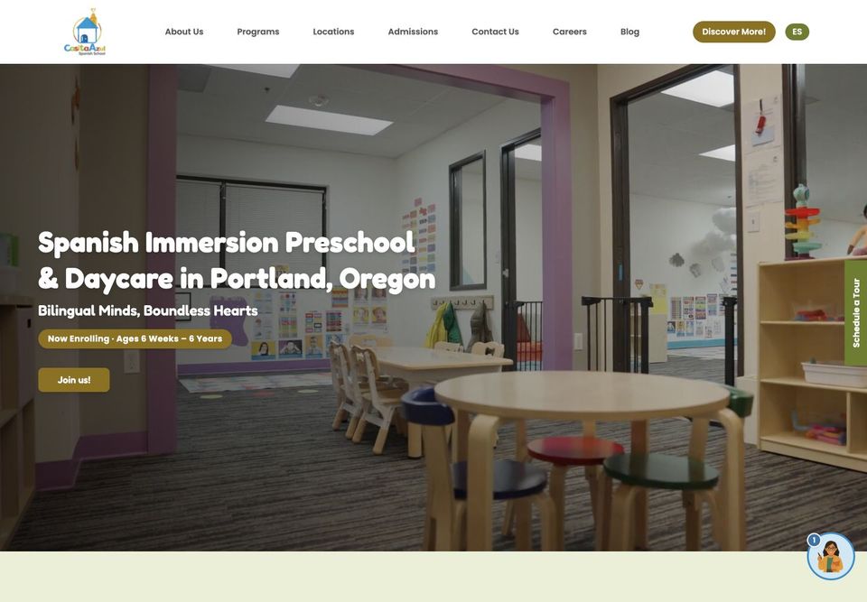
Casita Azul gives Programs and Locations their own navigation links. A parent considering care can explore what is offered separately from where it is offered.
This is useful for businesses with more than one location. Each location page should contain distinct, accurate information that helps someone choose or visit. Creating many nearly identical place-name pages is not the goal.
9. Put the audience's situation in the introduction
Casita Azul's homepage identifies Spanish immersion preschool and daycare in Portland and shows an enrollment age range. That helps parents understand the kind of program before exploring further.
Your own introduction should answer the equivalent question: who is this service for? Keep important qualifications in text, rather than only inside an image or a rotating banner.
10. Ask for information that changes the choice
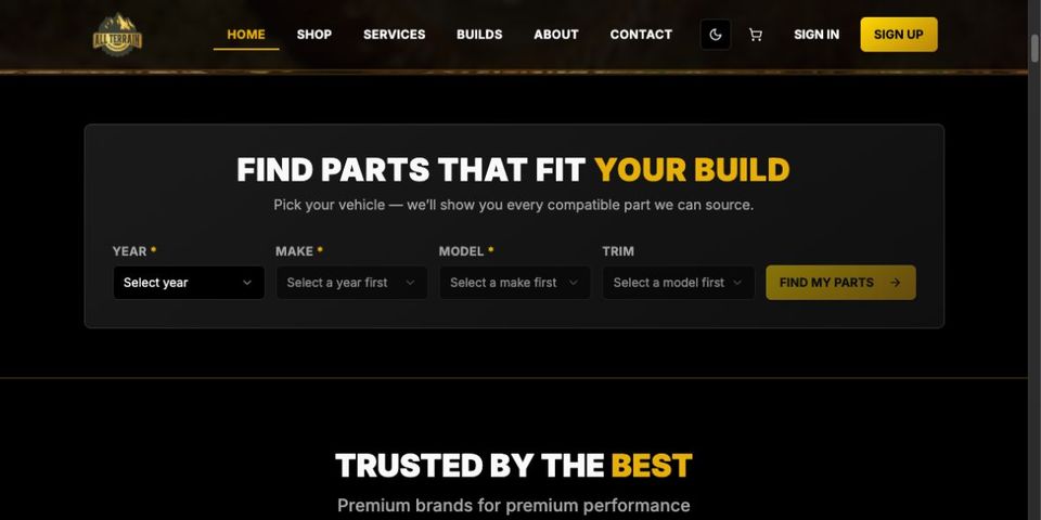
All Terrain Performance places year, make, model, and trim controls near the start of its shop experience. Those are relevant details when someone is looking for vehicle parts.
The screenshot shows the starting controls, not a verified compatibility result. The wider lesson is to identify which information genuinely changes the options you can offer and explain why you need it. Test the complete journey before promising a particular outcome.
Pages to consider for your own website
A service business will usually need an overview, useful service details, information about the business, and a clear contact route. Project examples can show the work you do. A shop needs product information and a working path to purchase. A business with several locations needs accurate details for each location.
Choose pages around real visitor needs. Avoid adding a page simply to repeat a keyword, and link related information where it helps the reader take the next step.
Common mistakes to check
- Headlines that never explain the service or location.
- Service names customers do not recognize.
- Forms that do not explain what happens next.
- Important information available only in images.
- Phone links, forms, or menus that do not work on mobile.
- Claims about results without evidence to support them.
Review your site as a visitor
Start with one task: finding a service, requesting a quote, or choosing a product. Work through it on a phone and a desktop. Note where the next step is unclear, then fix that before adding more content.
For a closer look at each project, read our six client website walkthroughs. If you need help with your own site, tell us about the project.
A local business can look at small business web design for a first website, or website redesign services to replace one it already has.